
Conceptual, self-started, project for Google UX Certificate
User Research
Ideation
Prototyping
Usability Study
UX/UI Designer
80 hours approximately
The goal of this project was to create a mobile application for a local cinema chain in East London that would allow users to watch trailers of films currently in the cinema and films coming out later in the year. The main focus of the app was on making cinema more accessible, so all trailers have closed captions and audio descriptions for those with hearing or vision impairments. In this portfolio, I will outline the design process and decisions that went into creating this app, and how the final product meets the needs of both the client and users.
"Movie lovers have not got a designated trailer 'hub' that includes inclusive trailers."
"A designated trailer platform for meeting accessible needs"

User Biographies
Competitive Analysis
User Interview
User Personas
User Journey Maps

Crazy 8s
User Storyboarding
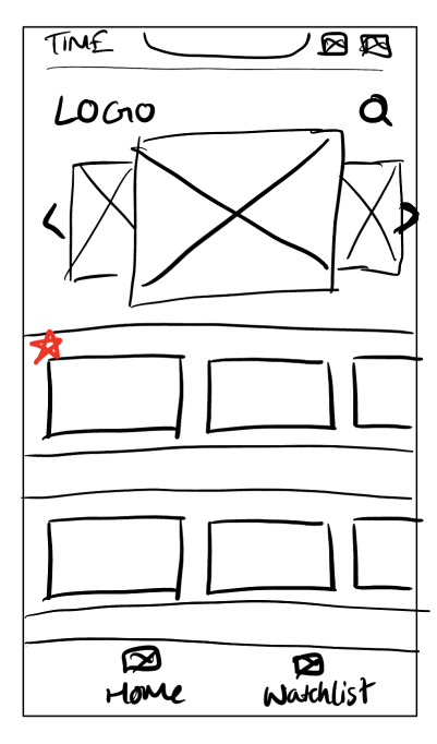
Wireframing
Usability Testing
Affinity Mapping
Patterns & Insights

High-fidelity Designs
Prototype
Usability Testing
User Biographies
Competitive Analysis
User Interview
User Personas
User Journey Maps
Crazy 8s
User Storyboarding
Wireframing
Usability Testing
Affinity Mapping
Themes & Insights
High-fidelity Designs
Prototype
As a UX/UI designer, I understand the importance of conducting thorough research before beginning any design project. For this project, designing an app for a local cinema chain in East London, it was crucial to understand the needs of both the client and their users. Through research, I was able to gather valuable insights that informed the design decisions I made throughout the project.
User biographies were a crucial part of my research process for this project. By creating detailed biographies that captured the needs and motivations of the target audience, I was able to design an app that was both intuitive and useful. The biographies helped me identify key features and functionalities and design an interface that was accessible to all users.
Here is an example of a user bio used:
Elliot is a passionate chef who loves to cook and experiment with new ingredients and flavors. He is always looking for inspiration for his next dish, whether it's through dining out, traveling, or reading cookbooks. Elliot lives in East London with his partner and enjoys trying out new restaurants and exploring the local food scene. As someone who appreciates good food and the art of cooking, Elliot is always interested in discovering new recipes and techniques. He likes to search for places to eat on his computer and values convenience when it comes to planning his cinema outings due to his busy schedule.
I conducted a competitive analysis for the East Flicks app to better understand the competitive landscape and identify areas where we could differentiate ourselves from other cinema apps in the market. By analyzing the features, functionalities, and design of competing apps, I was able to identify best practices and areas for improvement in our own design. Additionally, the competitive analysis helped me identify gaps in the market and opportunities to offer unique features that would appeal to our target audience. Overall, the competitive analysis was a crucial part of our design process, as it helped us create an app that not only met the needs of our client and users but also stood out in a crowded marketplace.


After building an understanding of the market and the target audience, it can be beneficial to conduct user interviews in order to obtain valuable insights and identify specific requirements from users.
Due to timing and there be no funding towards this project a short user interview was conducted with five different participants.


User journey maps are useful because they help designers identify pain points and opportunities to create a more seamless user experience.
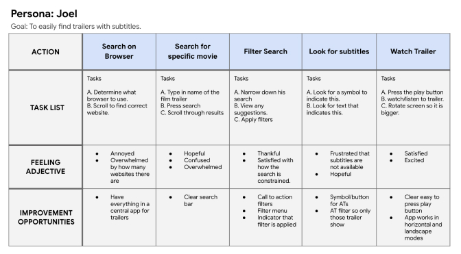
I created a user journey map for Joel, a 25-year-old Civil Engineer who streams films on his laptop in his free time. By mapping out his steps and pain points when using the app, I was able to identify areas for improvement in the user experience. I focused on creating a seamless and accessible experience for Joel, ensuring that the trailers he wants to watch have closed captions and audio descriptions. By doing this, I was able to meet his needs and those of others with similar requirements, ensuring a positive experience with East Flicks.
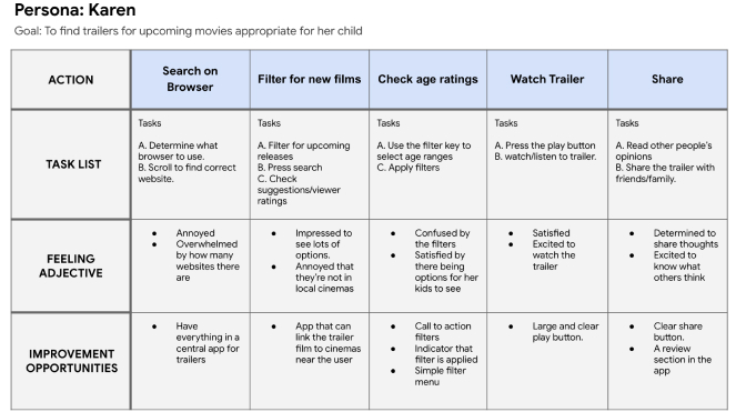
To ensure that the East Flicks app was user-friendly, I created a user journey map for Karen, a 39-year-old receptionist with two children. The map helped me identify areas where Karen might require additional assistance, such as finding age-appropriate activities for her kids and booking tickets for date nights. I also ensured that the app was easy to use for someone who is not tech-savvy, allowing Karen to watch trailers at home before heading to the cinema. By mapping out Karen's experience with the app, I was able to develop solutions to meet her needs and ensure that East Flicks provides a positive experience for users like her.
The 'Crazy 8s' exercise was an effective method for generating unique design ideas on paper. With only one minute allotted to each of the eight ideas, the exercise allowed for a free-flowing brainstorming session in which any idea that came to mind was quickly captured. This helped to foster a sense of fluidity in my design approach and allowed me to explore a range of creative possibilities in a short amount of time.

As a designer, I find broad overview storyboards to be incredibly useful at the start of the design process. By capturing the big picture of a user's experience with a product, it allows me to establish a clear vision for the app and understand how the product can benefit the user. This type of storyboard helps to align the product with the user's needs and goals, which ultimately leads to a more effective and user-friendly app. By taking a holistic view of the user journey, I can ensure that every aspect of the product is designed with the user in mind.
.jpg)
As a designer, I find that a close-up storyboard is a useful tool to get a more detailed view of a particular user task or interaction with a product. It's like zooming in on a specific part of the user journey and capturing the exact details of the user's interactions with the product. This level of detail enables me to identify any potential pain points in the user experience and make the necessary adjustments to ensure a seamless interaction. By focusing on a particular task or interaction, a close-up storyboard allows for a more refined approach to design, ensuring that the user experience is effective and user-friendly.
.jpg)
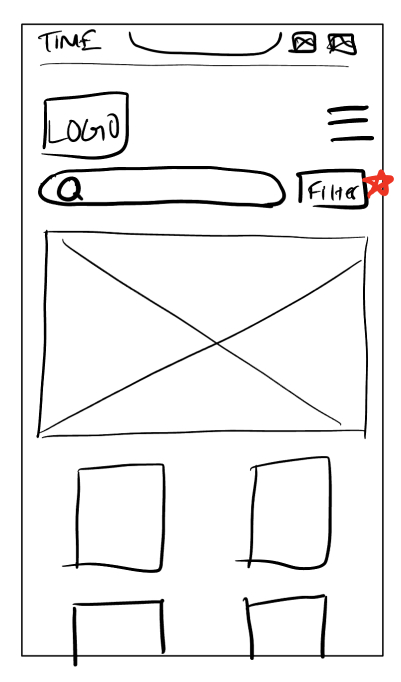
As a designer, wireframing is an essential step in the design process. It allows me to create a basic visual representation of the app's layout and functionality before adding any design elements. Wireframing helps me to test and refine the app's functionality and layout without getting bogged down in details like colours and typography. By creating wireframes, I can easily iterate and make changes to the design based on user feedback and testing. This approach saves me time and resources in the long run, as it helps me identify and fix any usability issues early in the design process.


After conducting a user test with the low fidelity digital wireframes, I found that there were many insights and feedback that needed to be analyzed and organized. This is where affinity mapping came in handy. By grouping similar feedback and insights into categories, it was easier to identify common themes and areas that needed improvement. Affinity mapping allowed me to make sense of the data collected from the user test and helped me to prioritize the issues that needed to be addressed. Overall, it was a valuable tool in the design process, as it helped me to identify key areas of focus and ensure that the high fidelity mockups addressed the needs of the user.
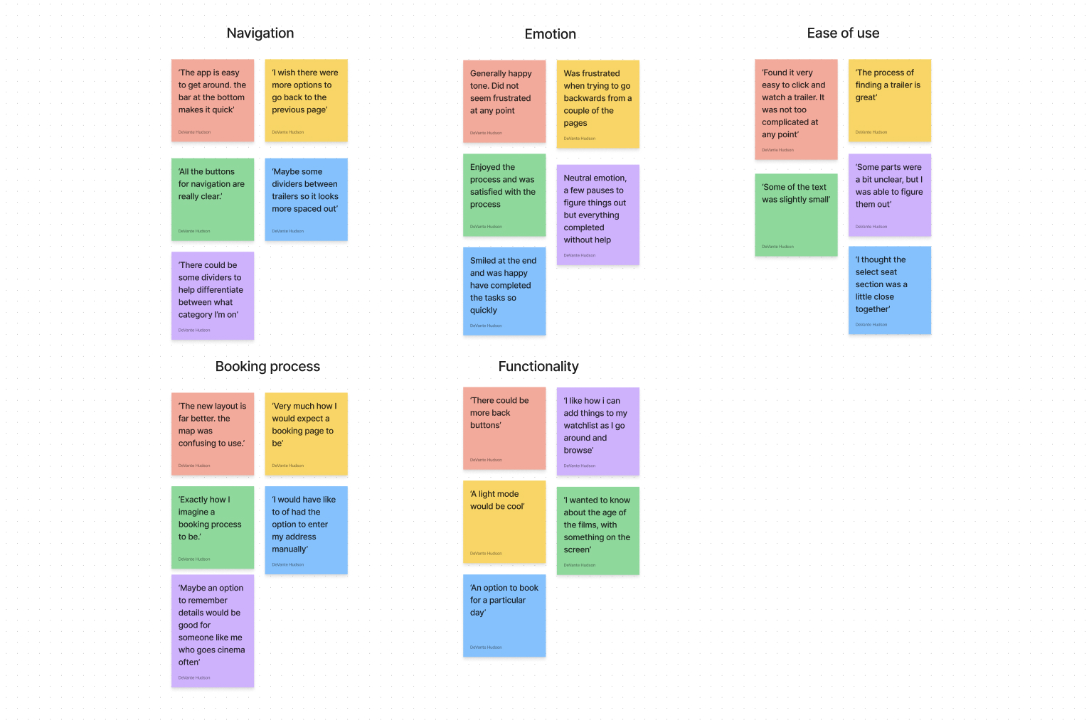
As I progressed from the low-fidelity mockups and prototypes, I conducted a usability study and used affinity mapping to derive actionable themes and insights. These findings proved essential in creating the more refined mockups and high-fidelity prototype. By gaining a deeper understanding of user behavior and preferences, I was able to identify pain points and areas of improvement, which led to a more effective and user-friendly design. The affinity diagram provided a visual representation of the data, allowing me to identify patterns and connections among the various insights.
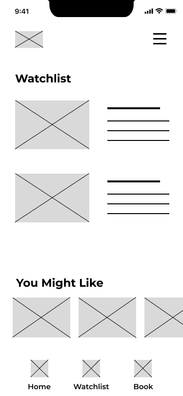
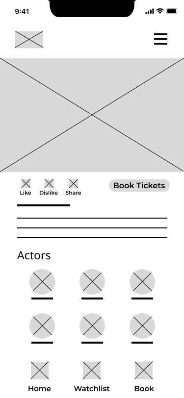
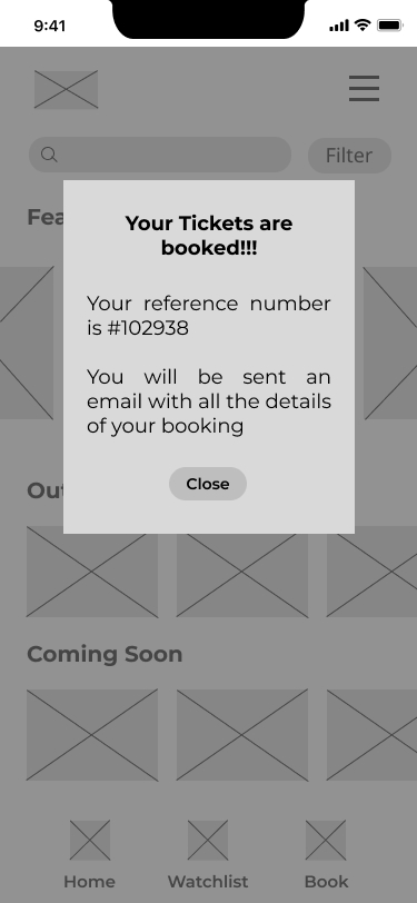
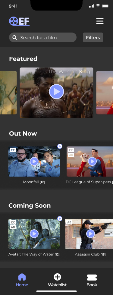
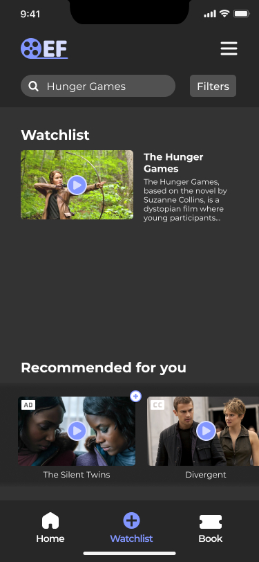
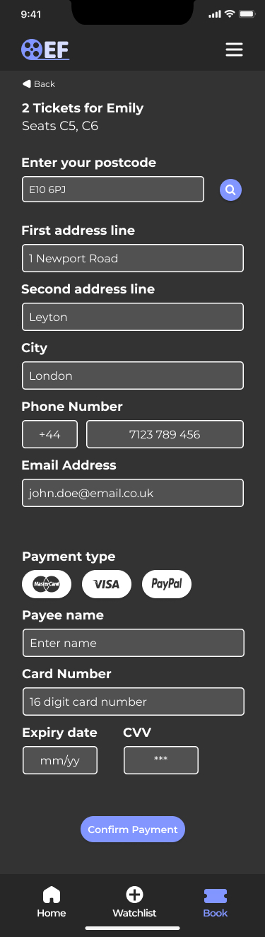
Following all of the research and ideation I have produced in this portfolio so far, I am pleased to present the high-fidelity mockups of the final product. These mockups represent the culmination of my design process, incorporating all of the user feedback, insights, and requirements gathered from my research. They offer a detailed visual representation of the final product, complete with accurate colours, typography, and layouts. The high-fidelity mockups will serve as a blueprint for the development team and provide a clear understanding of the final product's design and functionality.


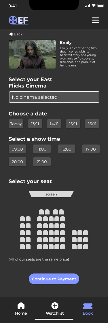
During the Prototype phase, I developed simplified versions of the product to test its usability and functionality. This process allowed me to identify any potential user experience issues, eliminate errors, and validate assumptions before investing a significant amount of time and resources in full-scale development. By testing the prototype, I was able to save time while ensuring that the final product met the needs of the target audience.
The prototype was created in Figma with the pages needed to complete the tasks presented to users.
The tasks the users had to do:
The app greatly simplifies the process of finding trailers that align with users' interests, offering them a seamless experience. Users appreciate the app's intuitive and straightforward design, which allows them to quickly navigate and discover trailers they would be interested in watching.
The site will address the issue that:
“ I love how quick it is to watch a trailer, and then if you like it, book tickets for it at your local cinema”