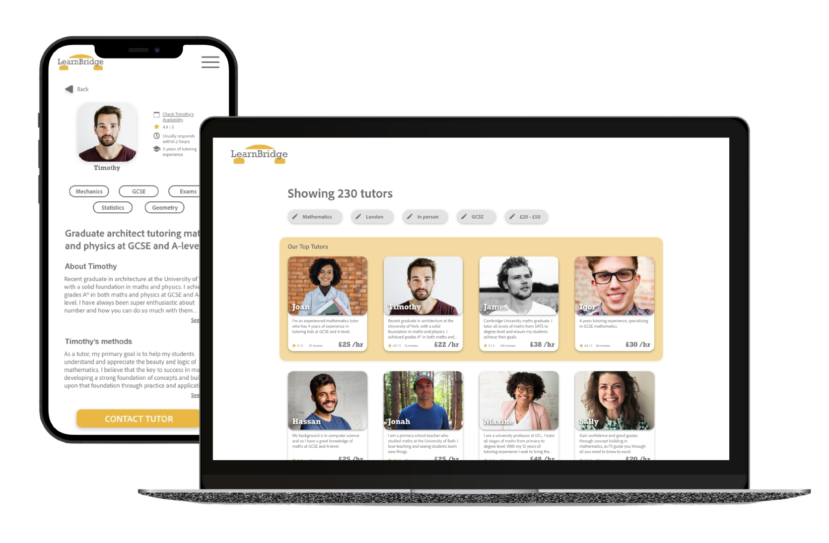
Conceptual, self-started, project for Google UX Certificate
User Research
Ideation
Prototyping
Usability Study
UX/UI Designer
80 hours approximately
LearnBridge is a tutoring platform that serves as a directory for people to find and contact tutors easily. LearnBridge are striving to make the process of finding a tutor as quick and hassle free as possible by providing a clean and easy to follow service.
They currently have a website that is not responsive, and they want to make the process of finding a tutor more seamless and accessible.
"The process of finding the perfect tutor for you is always quite difficult, due to the overload of possible tutors. The overwhelming number of results shown to users almost always needs to be filtered."
"A website where users can browse through a list of tutors that fit their specific needs straight away, in the first search. To also be able to directly contact their desired tutor straight away without the need of a ‘middle man’."

Competitive Analysis
User Interview
User Personas
Empathy Map

Site Structure
User Flow

Sketches
Wireframes
Low-fidelity Wireframes
High-fidelity Designs

Desktop Prototype

Usability Testing
Research allows me to get a real understanding of my users and put my self in their shoes. Through research I get to apprehend how an audience has hopes, fears, frustrations, abilities, constraints, and targets.
Before conducting any research, and to ensure it all stays on track it is essential to create a research plan. The plan consists of the research goals, key performance indicators, methodology, participants and a script.
To understand the needs of students and parents seeking tutors and the challenges they face in finding suitable tutors.
To identify the features that are most important to students and parents when selecting a tutor through a website.
To determine the factors that influence a student or parent's decision to enquire about tutoring services through a website.
Conduct an online survey of students and parents who have used tutoring services in the past to understand their experiences and preferences when selecting a tutor.
Conduct interviews with students and parents to gain a deeper understanding of their needs and expectations from a tutoring website.
Conduct usability testing to identify any issues with the website's user interface and user experience.
I conducted a competitive analysis for LearnBridge, which was crucial in understanding our competitors' designs and identifying best practices for our own website. By examining the user interface, layout, and visual design of competing tutoring websites, I was able to identify effective design elements that could be incorporated into LearnBridge. Additionally, the analysis provided insights into how LearnBridge can differentiate itself with a unique and appealing design that can stand out in a crowded market. This information was essential for developing a successful tutoring website that is easy to navigate, visually appealing, and engaging to students and parents alike.


After building an understanding of the market and the target audience, it can be beneficial to conduct user interviews in order to obtain valuable insights and identify specific requirements from users.
Due to timing and there be no funding towards this project a short user interview was conducted with five different participants.
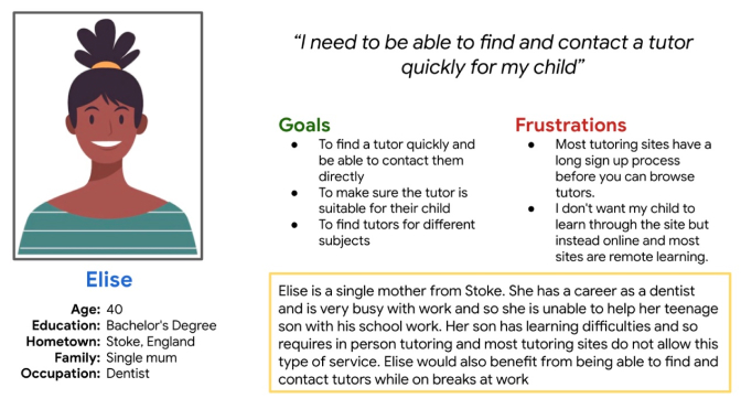
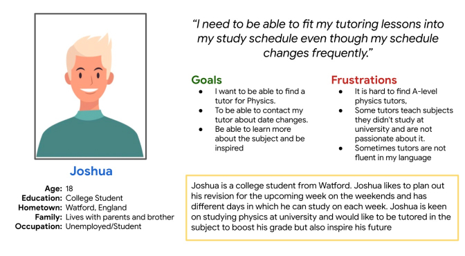
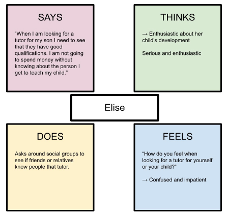
This is an empathy map for Elise, a potential user of my tutoring website, Learn Bridge. By understanding Elise's needs, feelings, behaviours, and pain points, I can design a more tailored and effective user experience. This map helps me create a more engaging and user-friendly platform that resonates with Elise and other users like her.
Creating a sequential site structure for LearnBridge was crucial because it helped users navigate the site easily and find the information they needed quickly. It also ensured that the flow of the site was logical and intuitive, enhancing the overall user experience. By organising the site's content in a structured manner, users could focus on their primary objective, whether it was searching for tutors, learning about the company, or booking a tutoring session. View the site structure here.

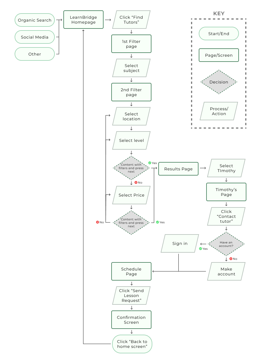
Creating a user flow for LearnBridge was important because it helped me understand how users interacted with the site and identified any potential roadblocks. It enabled me to optimise the user journey, making it more efficient and streamlined, improving the overall user experience. By mapping out the user flow, I could anticipate user needs and design the site accordingly, increasing the chances of user satisfaction and retention. View the user flow here.
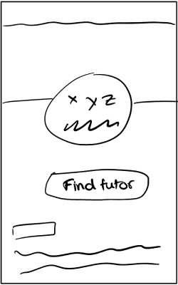
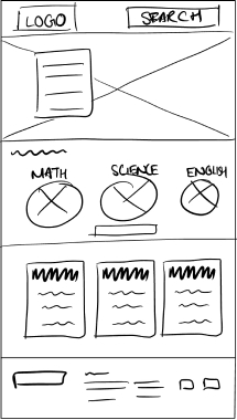
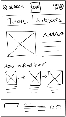
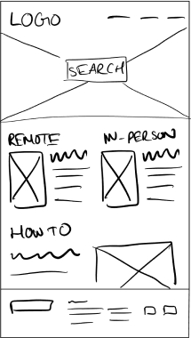
I created sketches for the LearnBridge site to quickly iterate on design ideas and explore different layout options before moving onto more detailed wireframes and prototypes. It helped me save time and identify potential issues or opportunities early on.
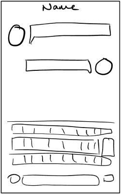
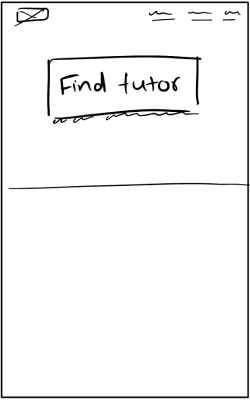
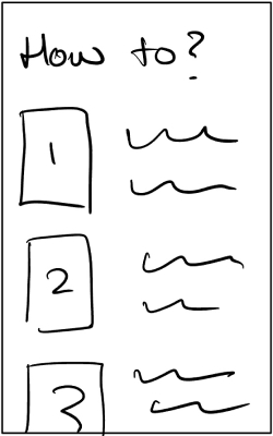
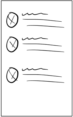
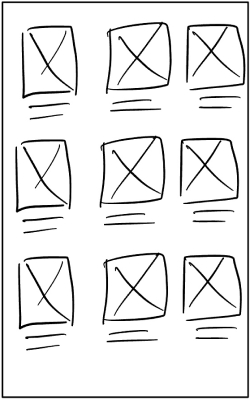
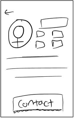
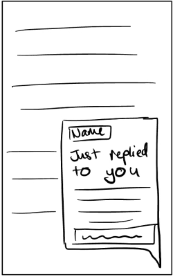
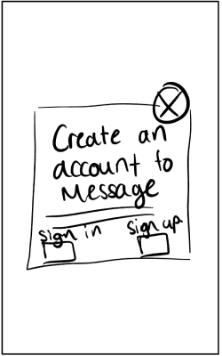
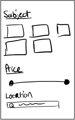
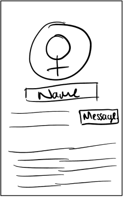
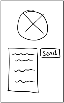
Wireframing is an important step in the design process as it allows me to plan and organise the layout of the LearnBridge website in a visual and concise way. By creating a basic skeleton of the website's structure, I am able to identify any potential issues and make necessary adjustments before moving onto more detailed designs. Additionally, wireframing enables me to communicate my ideas clearly with other team members and stakeholders, ensuring that we are all on the same page before committing to a final design. Ultimately, wireframing helps me create a well-thought-out and user-friendly website for our users to enjoy.
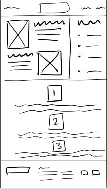
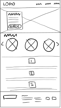
 - 1.jpg)
 - 2.jpg)
 - 3.jpg)
 - 1.jpg)
 - 2.jpg)
 - 3.jpg)
.jpg)
.jpg)
.jpg)
.jpg)
.jpg)
.jpg)
During the Prototype phase, I developed simplified versions of the product to test its usability and functionality. This process allowed me to identify any potential user experience issues, eliminate errors, and validate assumptions before investing a significant amount of time and resources in full-scale development. By testing the prototype, I was able to save time while ensuring that the final product met the needs of the target audience.
The prototype was created in Adobe XD with the pages needed to complete the tasks presented to users.
The tasks the users had to do:
I conducted two rounds of usability studies. Round one tested the low-fidelity prototype, helping to assess the websites overal flow and catch out any major pain points. The second study tested the high-fidelity prototype and helped to distinguish what parts of the mockups needed improvement as well as if the flow has been improved or detrimented with the addition of colour, font etc.
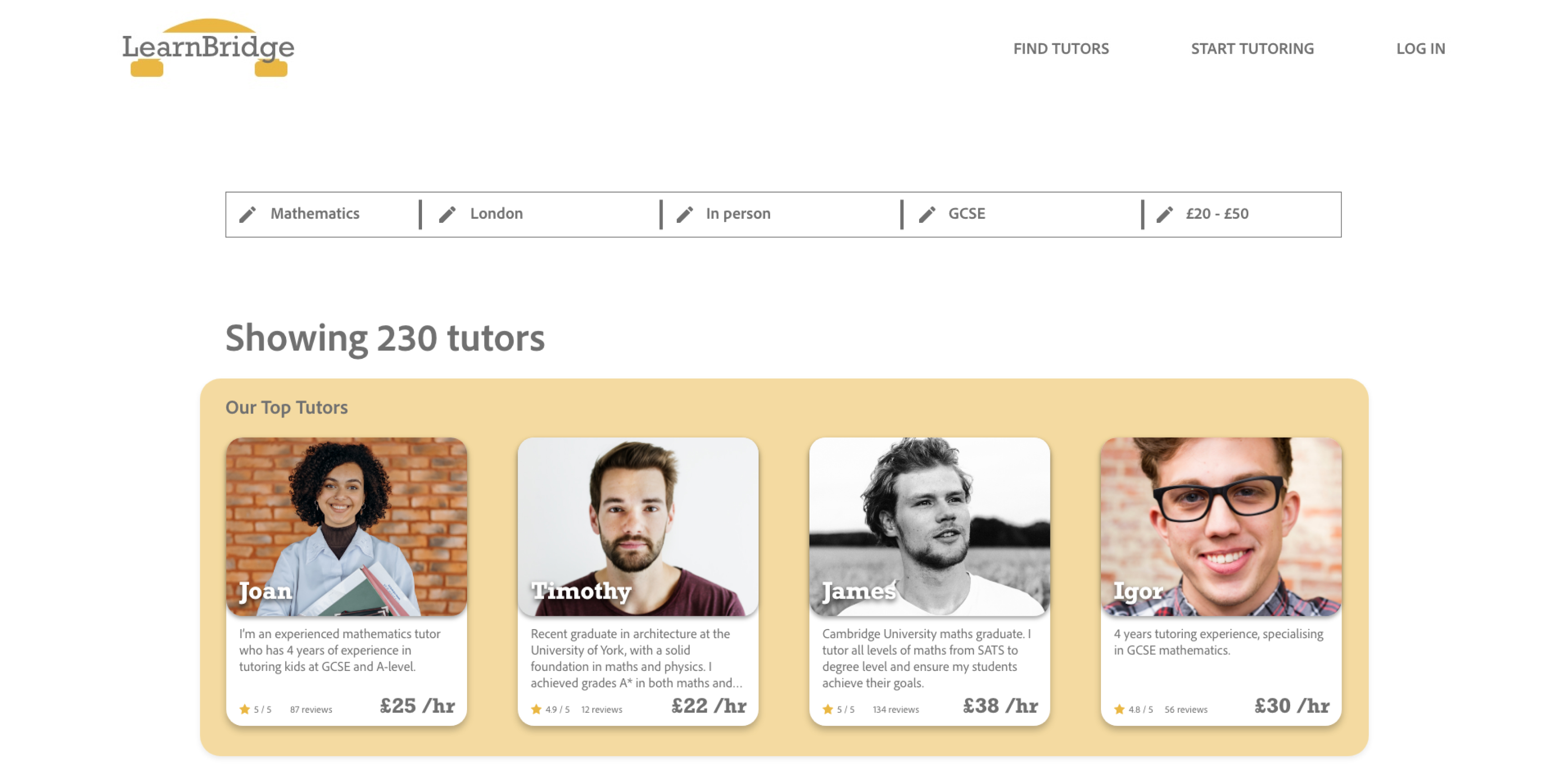
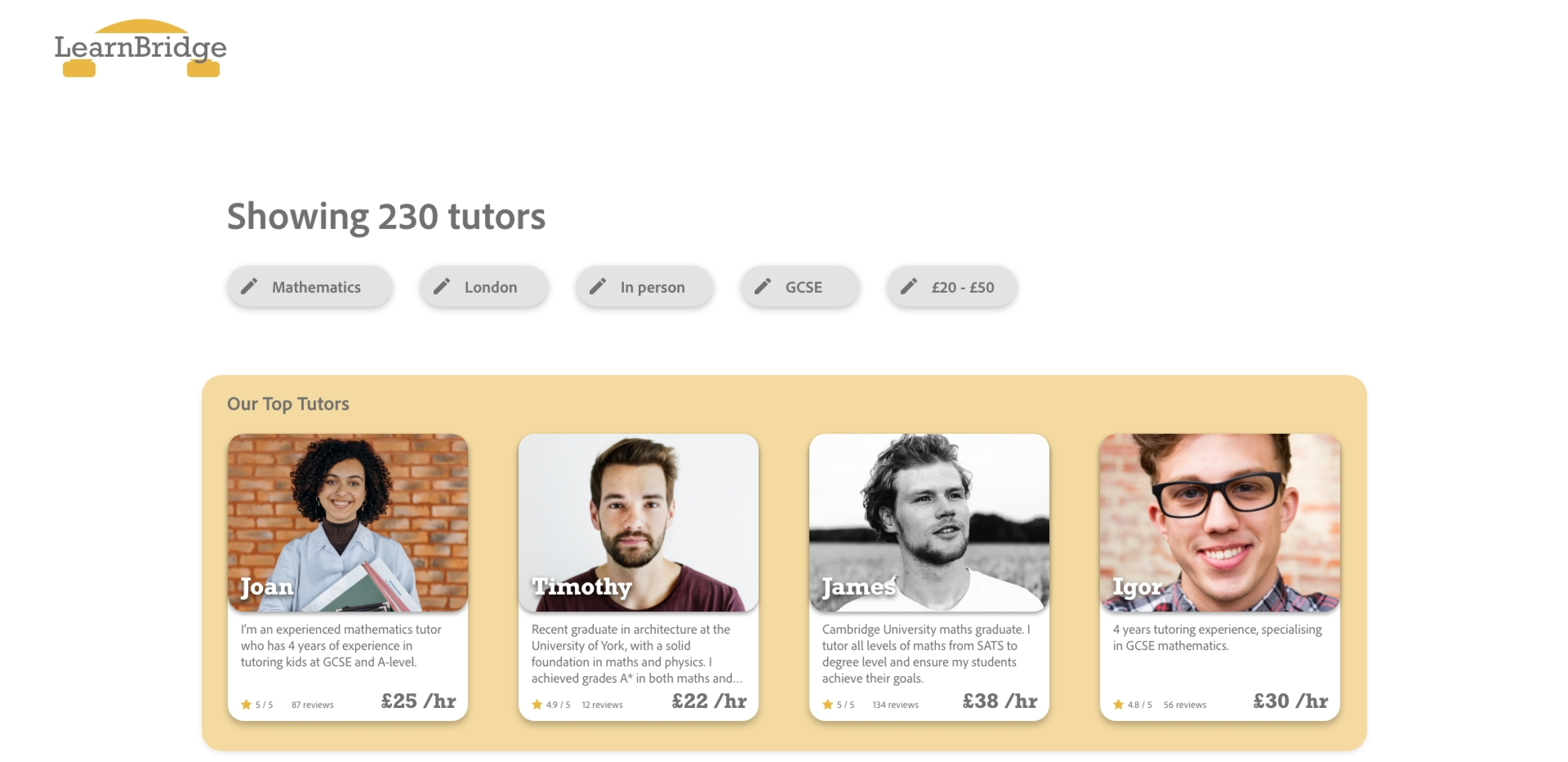
After the usability study it was evident that the participants were unclear on how to edit the filters they made once on the results page. When rethinking the design the chips were made to look more like what you find on other websites. This change was made to benefit from the familiarity that users will have and therefore make their experience easier.
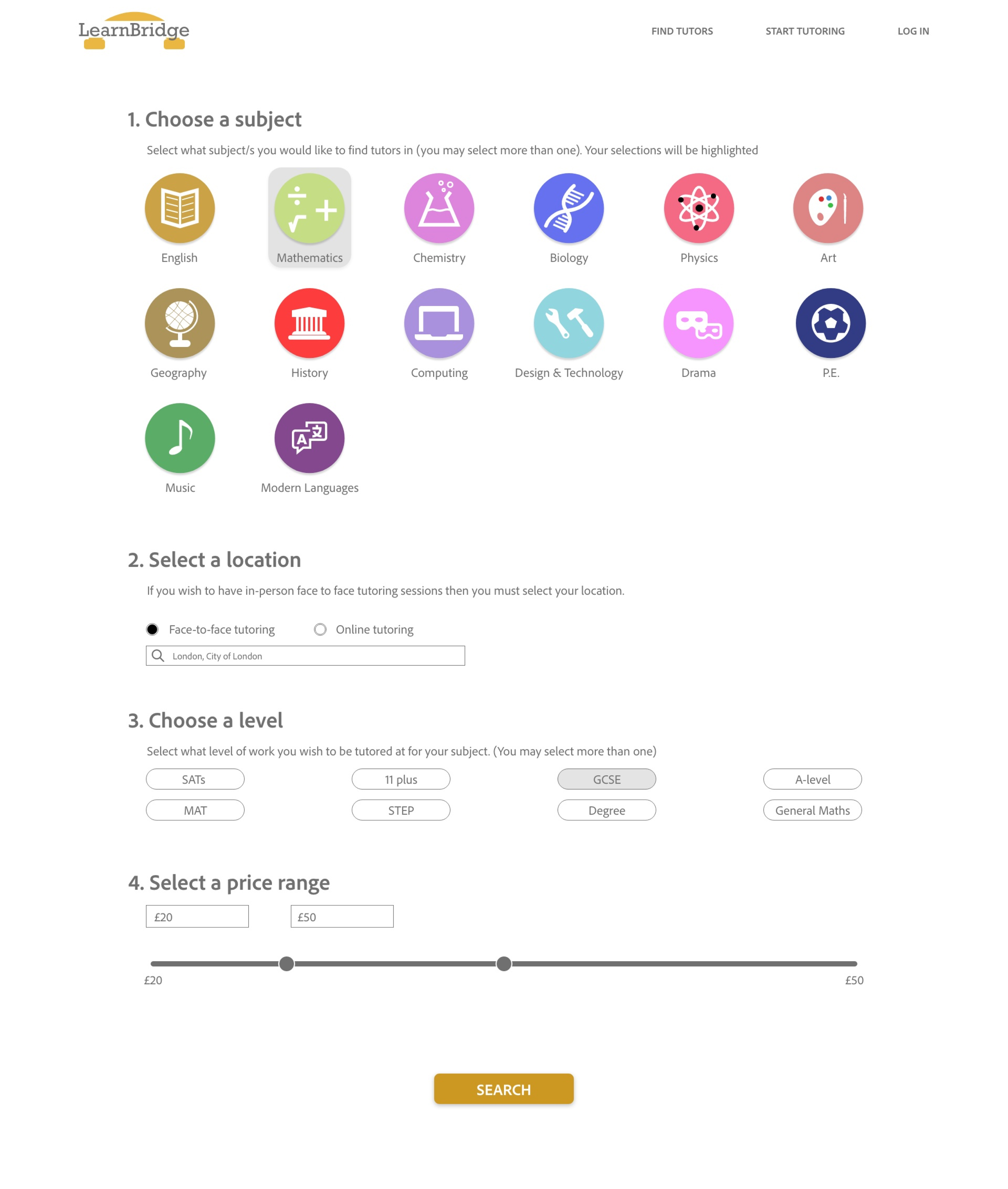
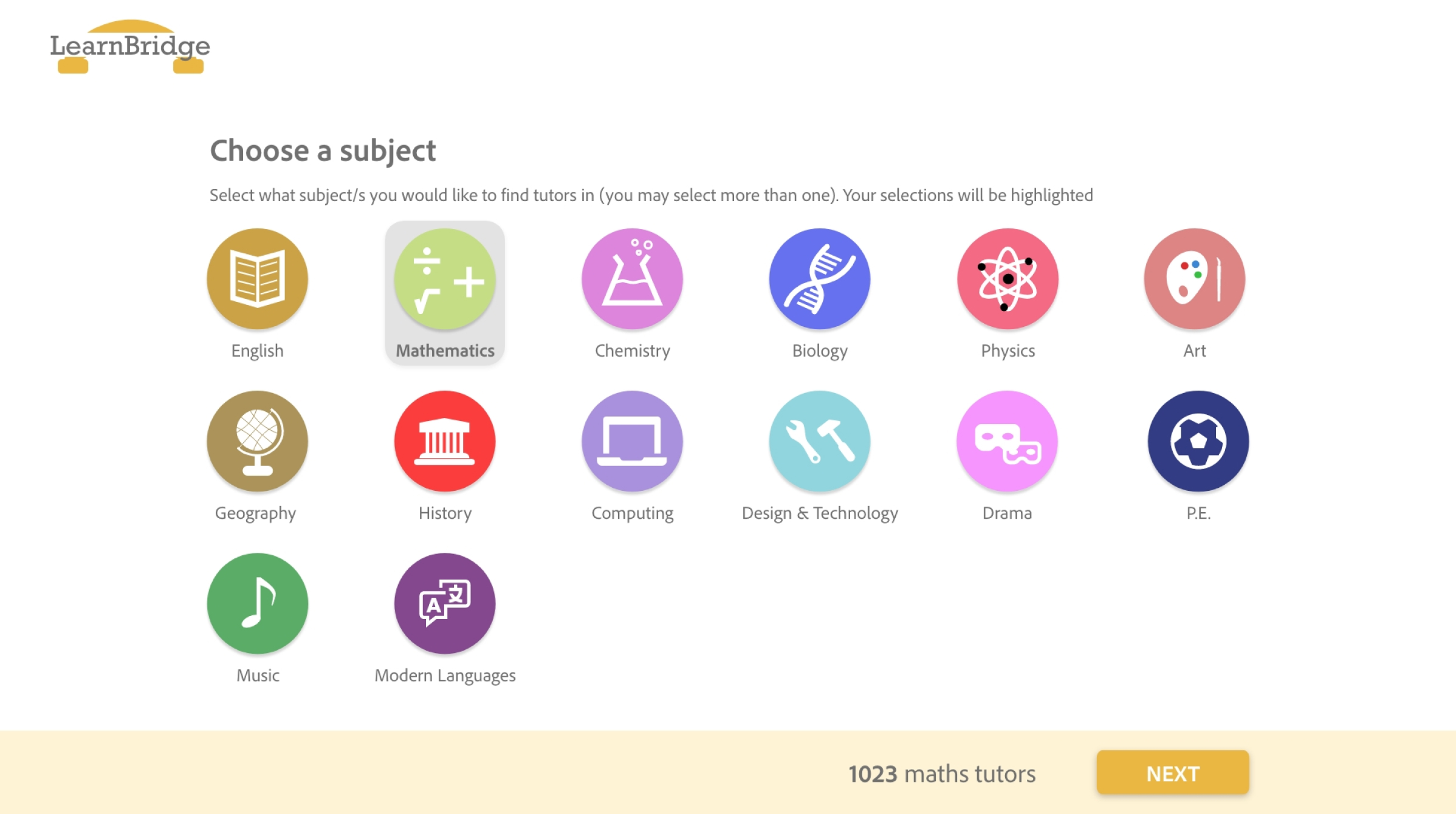
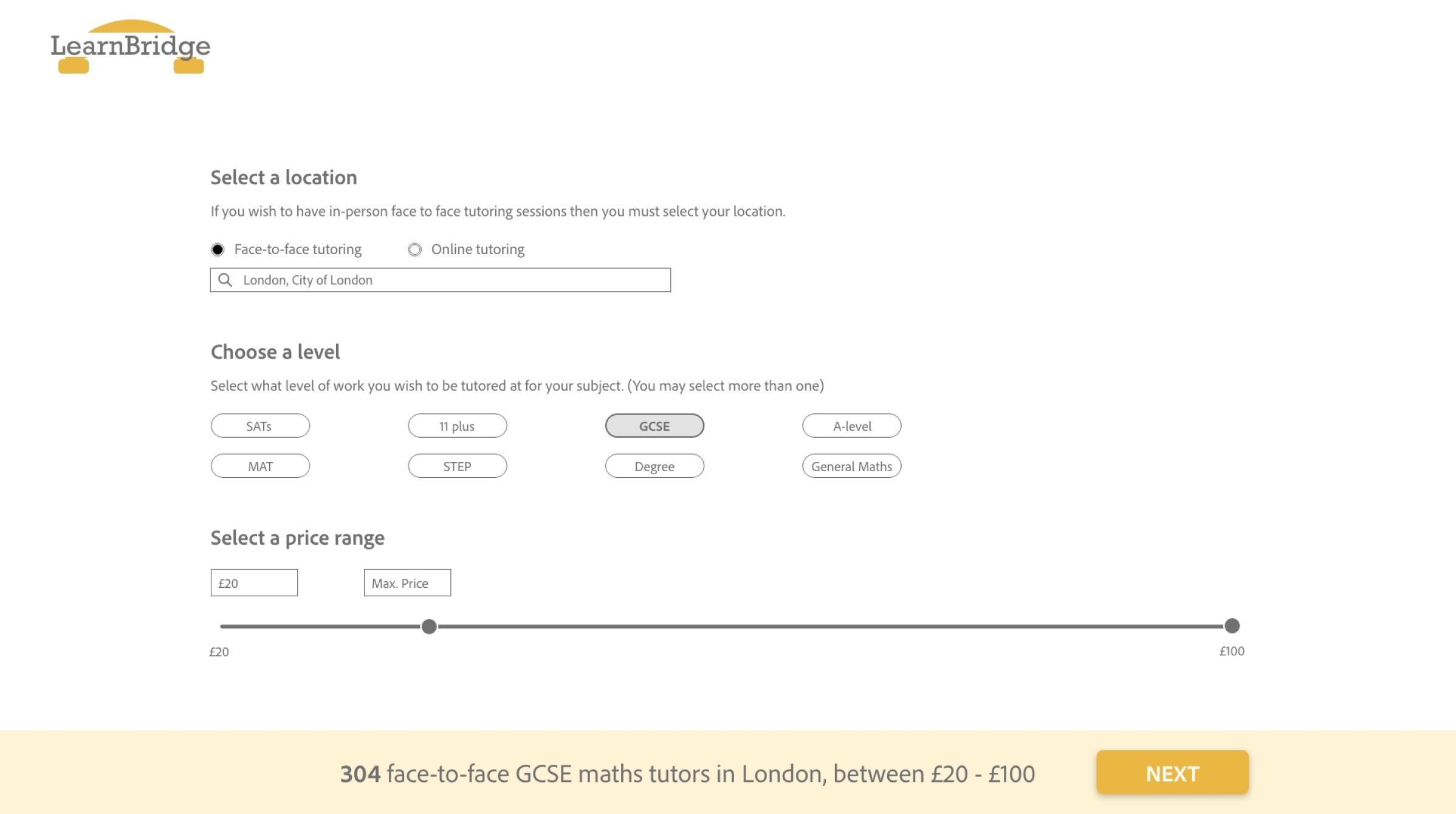
The biggest change was within how users interact with the main flow. Firstly the navigation bar was removed as to remove distractions. The second change was to how the filters were applied and the information given back to the user as they fill in the sections. This was done with the purpose making their user experience better as they will know if they put any wrong information into the fields and will save them having to make edits when the results are not as they were expected.
This website fulfills its purpose in making the process of finding a tutor quick and simple. Also, it is responsive which means it caters for our user personas who are busy and need to do things on the go.
The site will address the issue that:
“I really enjoy how easy the site is to navigate and the steps for filtering the type of tutors you are looking for are great to follow”